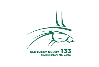
When the 2007 Preakness logo was unveiled earlier today, I was happy that it was better than the abstract Kentucky Derby logo. I do have some issues with this Preakness logo. First, the Preakness colors have always been black and gold (like a Black Eyed Susan), not blue and gold. Second, the one that really gets under my skin....Why does the official logo need to say "A MAGNA ENTERTAINMENT EXPERIENCE". If chairman Frank Stronach had actually been to Pimlico recently, he would agree that it is an experience, but he probably would not put his company name on it.



2 comments:
I like the new layout for the Preakness Logo, but the colors should have stayed the same. I can't quite figure out what the Derby's logo is trying to prove either. As far as an experience, does Magna really want to promote the experience, considering a majority of the crowd goes for the infield party, which is quite an experience!
You said exactly what I wanted to about 'A Magna Entertainment Experience' and the current state of Pimlico!
Post a Comment